2026
"MADUDU" and "MAXIAORAN"
Entrant
Innovent Biologics, Inc.
Category
Design and Creativity - IP
Client's Name
Country / Region
China
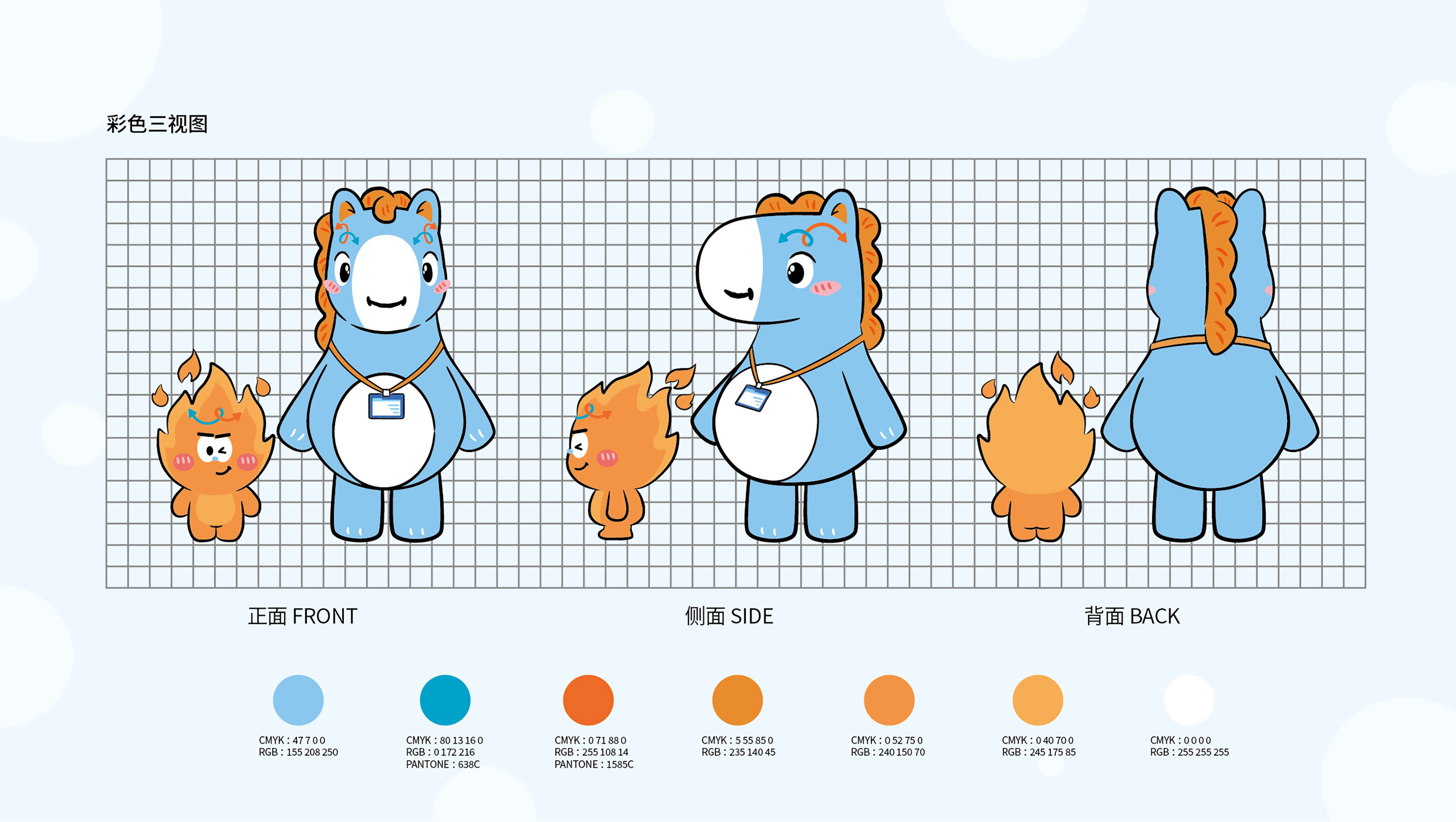
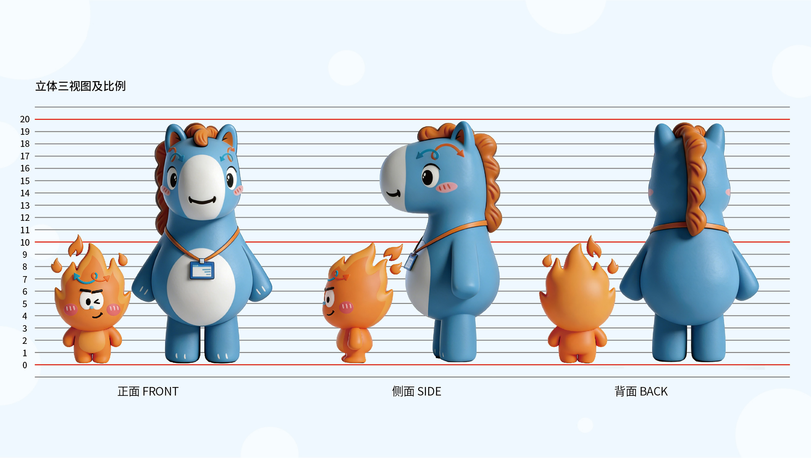
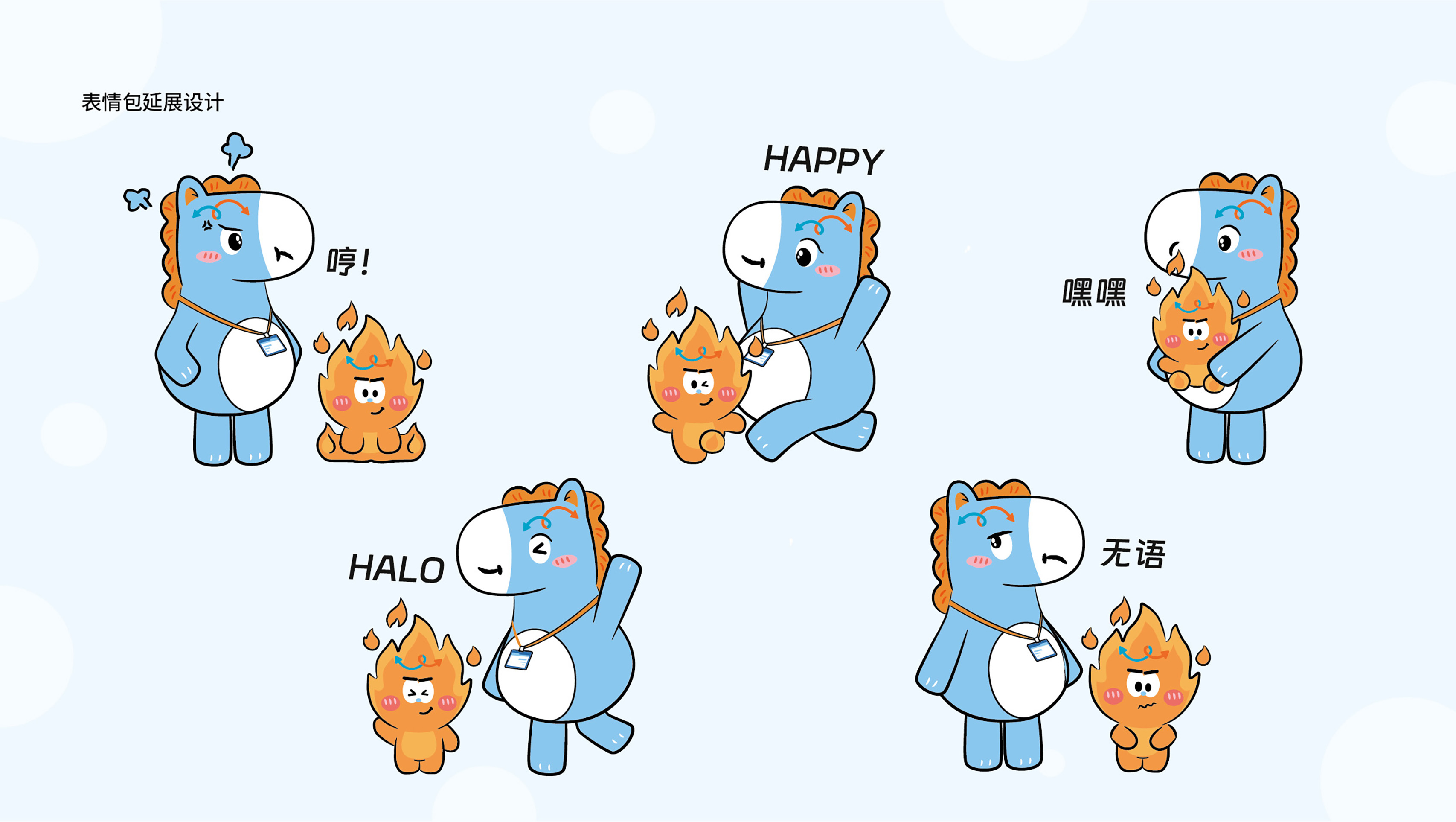
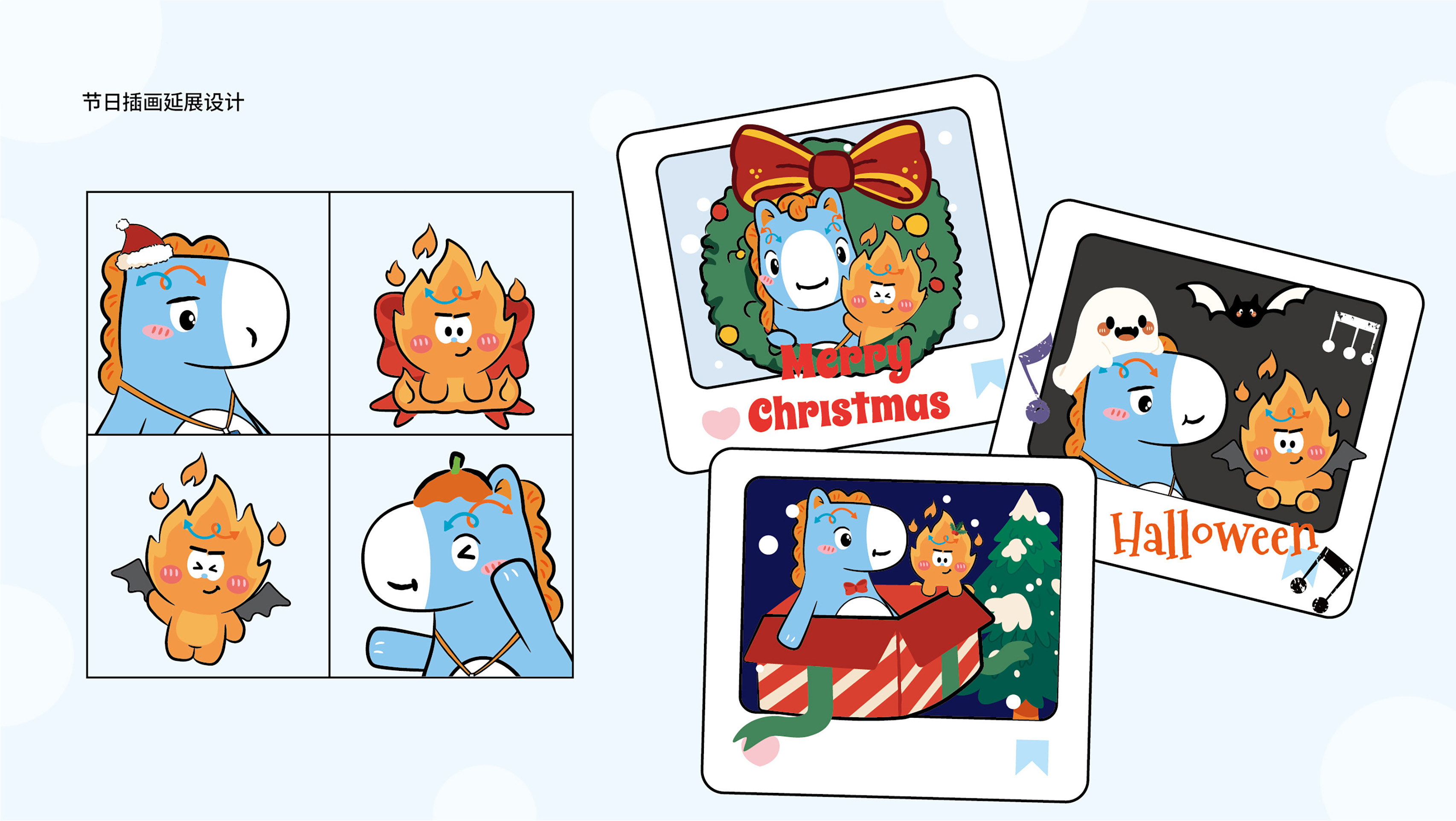
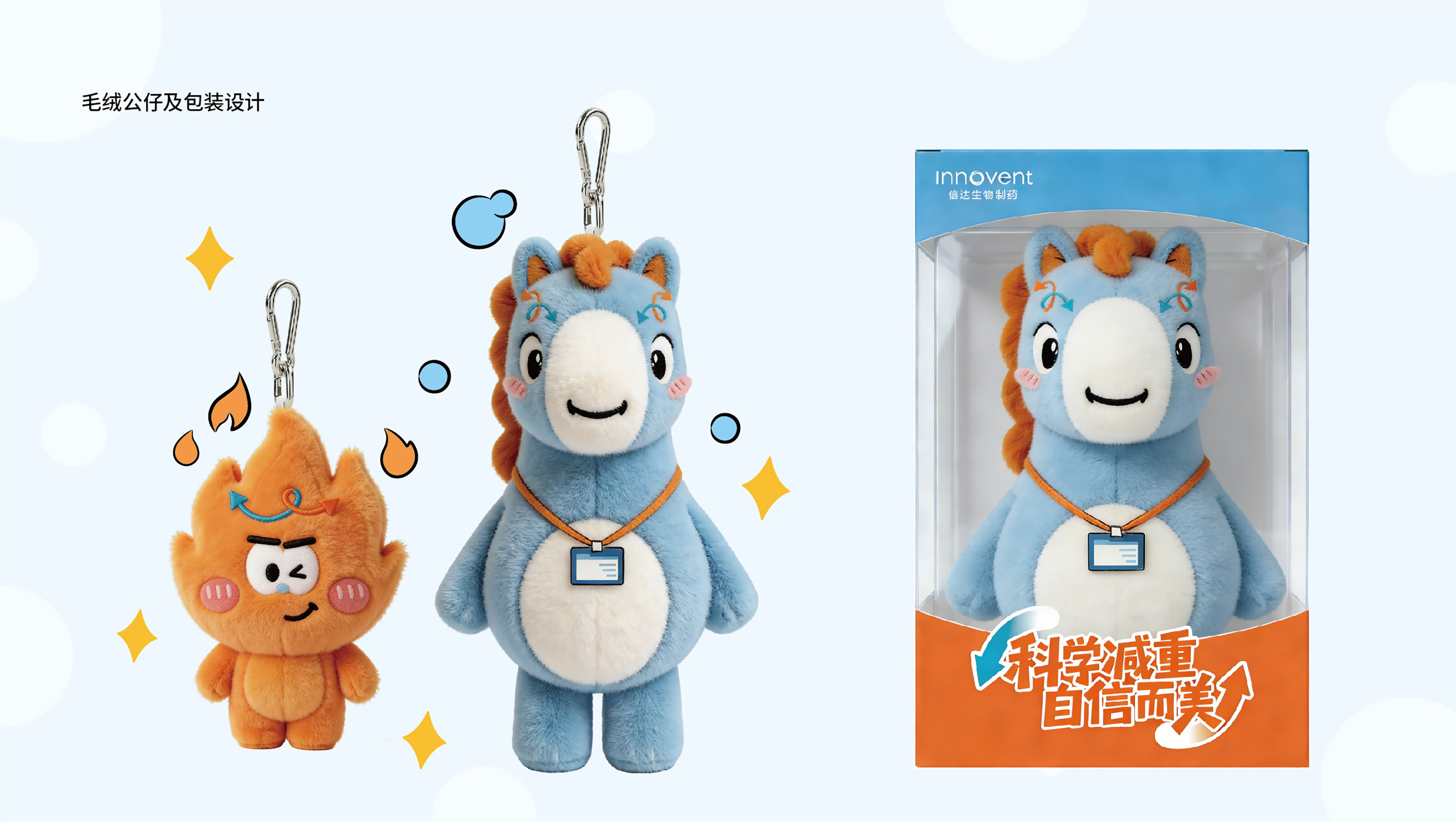
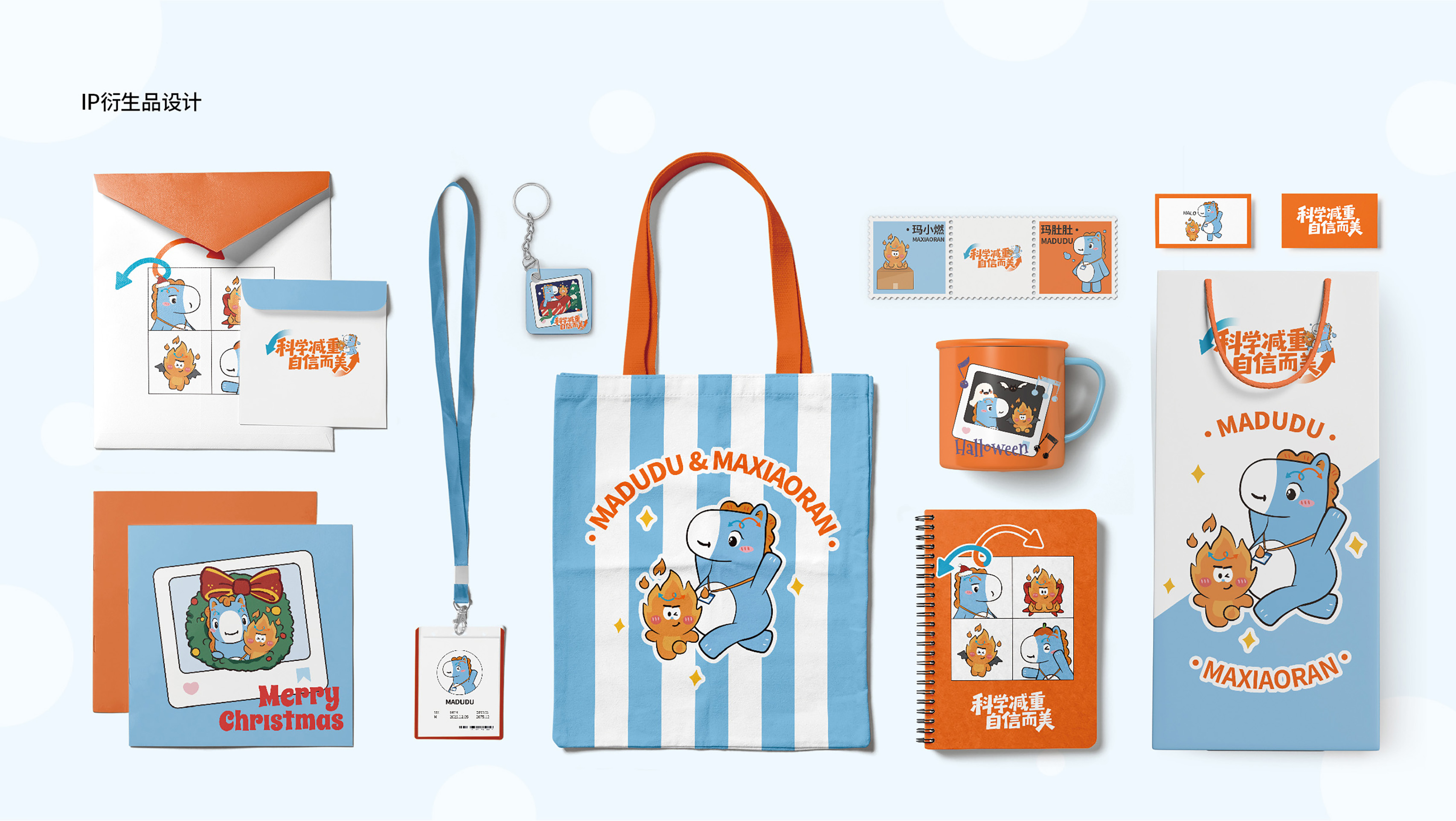
Exclusively crafted for a pharmaceutical product, this dual-character IP translates complex medical mechanisms—often perceived as rational and abstract—into a warm, approachable visual narrative. By lowering the comprehension threshold, the IP transcends the role of a mere decorative element. Instead, it is incorporated as a key visual medium that supports users in understanding the product, connecting with the brand, and adhering to the treatment regimen.
Complementary and interdependent, MADUDU and MAXIAORAN respectively symbolize "the user's state in need of change" and "the product's power to drive that change." Together, they create a cohesive visual symbolic system characterized by narrative continuity and a sense of companionship. This system is integrated throughout the user journey—encompassing education, brand communication, and the medication experience—thereby transforming product communication from a one-way information delivery into a perceptible, relatable interactive relationship.
In their visual realization, MADUDU takes the form of a sky-blue pony, with its color palette extending the brand's visual system to communicate a foundational sense of rationality, trustworthiness, and wellness. Its soft, rounded proportions and prominently amplified abdomen contour visually pinpoint the widespread concern of abdominal fat accumulation. This design ensures high visual distinctiveness and immediate user empathy. In deliberate contrast, MAXIAORAN is derived from the image of an orange-red flame. Its warm, vibrant hue signifies metabolic activation and positive change, while its dynamic, flickering form serves as a metaphor for the sustained process of fat burning. Together, these elements translate the product's core benefits into a tangible, intuitive part of the overall visual narrative.


Credits

Entrant
Exemplifi
Category
Website & Mobile Sites - Website Redesign
Country / Region
United States
Entrant
Laura Becker
Category
Design and Creativity - Graphic Design
Country / Region
United States
Entrant
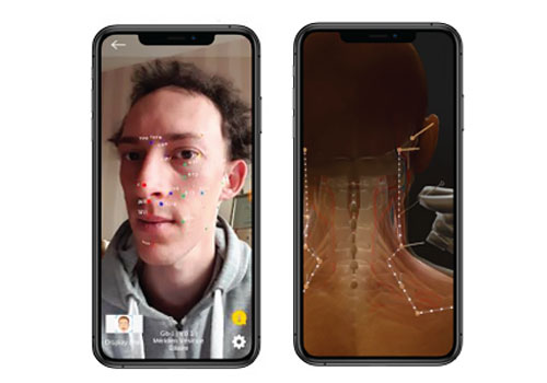
AR Acupuncture Pty Ltd
Category
Apps & Softwares - Best Innovation
Country / Region
Australia
Entrant
ARTIFICIO
Category
Strategy & Marketing - Experiential
Country / Region
Italy